Wednesday, December 30, 2009
MacProTouch and TV
The Macprotouch could potentially change the way TV is distributed, managed, and viewed. Let's get real here, people watch tv online all the time, legally and illegally, and with the MacProTouch, TV suddenly can become a portable concept, not just something you sit and watch, but something you can watch at any time.
Think of the model of cable tv: You buy a certain number of channels, you subscribe to each channel. You never get the show you want, when you want it. You then pay for Tivo to ensure you record the right channels at the right time to get what you want?
Why not incorporate TV channel concepts using the internet?
For example, you open up your iTV on the MacProTouch, and decide to subscribe to the HBO and Movie Channel. You can now stream both channels online, a similar experience to TV, as in you easily flick between each channel while its streaming, but instead its streamed via web, not cable.
You see a repeat show of Sopranos is on, but you'll be out of the house. No problem, touch on the schedule to 'TiVo' Sopranos. Two things will happen: your MacProTouch is switched off, so the episode is downloaded into a user 'cloud', that the user can access when they switch it on. If your MacProTouch is switched 'on', the laptop can automatically download the show WHEN it happens, locally to your laptop. 'TiVo'd shows can stay online in a cloud for up to say a week if that is the user preference, which saves time and space on the harddrive.
Of course, the experience of watching TV is a bit different that watching it on a laptop, but here is where the clever part can come in. You can now watch TV as it airs on your laptop via wireless, or on a typical TV monitor via cable, AND you can hook up your laptop to your monitor (possibly remotely) to watch 'TiVod' shows on the big screen. It pleases the advertisers, cable channels, internet users et all, by tweaking the business model, not by reinventing the wheel.
Saturday, October 17, 2009
Webcam : I see you!
So imagine the MacProTouch can 'see you'. Microsoft research is thinking in this direction:
When you tilt your iPhone, it responds in kind, which is pretty cool for gaming.
Now imagine you don't have to tilt your MacProTouch at all. You simply face it while say standing in front of it, and by moving, you can affect what's on the screen.
Examples of this might be:
Video conferencing. You can freely move around as the camera follows you.
Gaming. A skiing game is a great example of this, by leaning to the left and right of a wall mounted MacProTouch, you can affect how the game is played.
If this was a widescreen entertainment version of the MacProTouch, imagine the experience of skiing down a virtual slope by applying correct pressure on your skis.
Creative/physical therapy: I want to discuss this topic in more detail, but imagine a virtual lump of clay on the MacProTouch screen. As the user gestures, depending on the tool he selects, he can cut, rotate, or mould the clay. It's an entirely new experience for artists, but it also opens up (along with gaming) a world of physical therapy not explored, because the movement is based on your gestures and interactions with the cam.
Iphone's don't leverage the capability and interaction possibilties of a webcam, but current laptops do come with one, so why not take this one step further with the MacProTouch.
The death of industrial design?
The simple answer: no. Because a bad product design can greatly affect the perception of the interaction design.
Here is a good example:
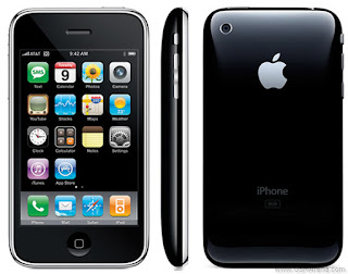
The iPhone (big shock)
The interface obviously creates most of the engagement with the product. BUT, it is the interaction between the physical and virtual that makes this a truly beautiful product to use. The physical press of the home button, is a satisfying action (actually I don't like how the interface behaves here, but i do like the physical design of this button). The mute, volume control and reset button are all slick, fit in nicely within the hardware and maintain a smooth symmetry when the iPhone is looked at from the side/top. You'll notice how the mute button is exactly aligned with the volume control when it is not on mute. This serves too purposes, 1. it shows a level of detail not recognised on a conscious level but appreciated on a subconscious level (it would be jarring if this alignment was off by even a fraction), 2. it visually tells the user at a glance whether this button is on silent or not (the orange dot also helps).
The way the iPhone fits in the the hand makes it comfortable to use, and though the product design is not a design that is in your face (like the nano), its the subtlety and quality of the design that adds to the interaction experience.
A bad example: the HP multi touch PC.
There's a couple of reasons this has bad product design. This is essentially a regular PC with a touchscreen.
Note how the user, demoing the product, has to hold the lid while performing touchscreen maneuvers, so that the lid doesn't push back etc.
So much room is taken up with the keyboard that it takes away from the touchscreen. The product design has become such a hindrance on the interaction design that the experience of the interaction design is lessened in the mind of the consumer.
So with touchscreens, product design is still a vital part of the tactile experience, and a subtle well designed product that works with the interface in a seamless way can make or break the impression made on the user.
Thursday, September 24, 2009
Under Pressure
Except for one small problem: pressure. Pressure is vital to all these forms of communication, because it allows for a subtly and various in pen/brush strokes that can not be replicated by a plastic supposed to be a pen.
Some styluses (?, stylusii?) use proximity to the surface to indicate pressure, but this has an unnatural feeling to the process and the user has to relearn the technique.
Nothing beats the pressure you feel as you place a pen against paper, how the paper responds to your every stroke. So the question is: should a touchscreen try and replicate this behavior?
I think it absolutely should. This for me is the key 'game-changer' of touch screens. The ability to draw/write naturally and then EDIT those sketches, is something that has never been done before.
Imagine Van Gogh painting sunflowers on the touchscreen the way he would on a canvas, furiously, naturally, the truest connection between man and canvas. Now imagine he can change each individual stroke, reuse it, animate it, delete it even. It opens up a new level of artistic expression and artistic perfection never before seen in the real world or virtual world of computing.
Imagine taking a sketch of a concept car and converting those lines to a 3d dimensional rendering which you can 'mould' in Autodesk. Gestural working a mould of clay on a 2d touchscreen connects the brain to the z axis in a new and exciting way, and ups the stakes for everyone. Now Photoshop and Autocad have entirely new software paradigms to construct.
A simple concept of pressure, can fundamentally change the software industry.
I should be able to take an actual paintbrush and use it on the MacProTouch. For every hair in the brush to be recorded, the pressure I use in the stroke, the speed. Then MacProTouch goes from entertainment system to a truly mindboggling system.
Microsoft Courier
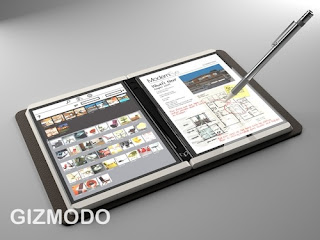
By now, most of you have seen Microsoft's concept touchscreen laptop at gizmodo.
There are some great, and not so great ideas in here.
First, I have to say making it look and behave like a normal notepad, just makes me realize how fantastic and enduring the notepad and pen is! But I do like the use of the pen, and I think this could be an important peripheral for MacProTouch (I will describe the design in detail)
Second, the hinge........sigh, the hinge. Basically this is a laptop, on its side, with two touchscreens.
And then there's that hinge, stealing some valuable real estate, and mercilessly cutting my large touchscreen on which I can watch a movie in wide screen, into two smaller windows.
Well I guess I could watch two movies at the same time!
But yes, not a big lover of the loss of screen size to hardware.
Also the swiping from one part of the screen to the other...........why? WHY!? OK, i get it, its supposed to be more a journal than a large drawing tablet, but still, I feel a bit cheated on that one. Surely the UI is small enough and well designed enough to collectively order my work in the appropriate way. I am not sharing a file from one screen to the other, I'm simply moving it, seems a bit pointless.
One thing I love is that the camera is at the back of the laptop, so you can take pics of what you're looking at, this is something I did not consider in the MacProTouch, but now an infinite number of possibilities opens up. Record videos of your holiday with your laptop then send them to your friends........perhaps that's too much power!
The UI is good, but i think it is a little unintuitive, in fact it seems messier than what I would actually do in a journal. (make this project my homepage? - apparently we still live in a single-tasking world where consultants only work on one project a time, heaven!)
But still, I'm amazed Microsoft is thinking this way, its great actually, and any innovation is better that none.
But, oh........that pesky hinge.
Wouldn't it be simpler to have a single screen and include a 'journal' software program that splits the screen into the Courier style design? No loss of features OR real estate!
Monday, September 7, 2009
Gestural computing
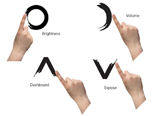
If you look at an Apple keyboard you'll see icons representing some commands outside of a typical interface. e.g.dashboard, or expose.
The idea is simple, rather than put these on a touchscreen keyboard, use simple dashboards to indicate what you want.
E.g. a circle pops up dashboard, a square: expose.
Of course this means a few problems:
Gestural commands can be easily misinterpreted. A square with soft corners, could be perceived as a circle, for example.
Gestural commands have to be quick. No drawing the sun to indicate brightness, it would take too long.
Gestural commands might be limited initially.
But the potential of this new world of gestures, changes computing from a simple display to something truly interactive. You can 'speak' to your computer with simple signals, and really its the next step of evolution in computing: binary entry, command line, point and click, signal with natural gestures.
Imagine this new wave of sign language computing, and the possibilities. Application and game developers can create custom signs for their programs, users can interact with their computer and with each other, through simple gestures. Imagine your web cam even understands simple gestures. Now you can talk to your friend online, and signal to HIS computer activities you want to do. (share a document, send a smiley face, anything!)
It elevates how people interact with computers (badly) and puts us in the drivers seat because we can teach computers gestures they can learn from.
Thursday, August 27, 2009
Interact 360
This will be resolved later in the blog, but one revision of the hardware may be required.
Like the iPhone, this product should be able to rotate a full 360.
If we look at Microsoft Surface, (read my design blog on it here) the interaction of the touchscreen is different because:
- It doesn’t rotate, or behaves like a coffee table (i.e. multiple users can grab and play with multiple items, so the interface has to be viewed from ANY angle and still be intuitive.
- certain items and interactions have only one orientation, e.g. watching a movie, reading a book. (one user can do this, but the other user at the opposite side, will not be able to enjoy the experience in the same way (if at all!)
Because the MacProTouch is more of a personal item, I am taking the assumption that one or more people is facing it the same way.
Another thing to note about rotation is peripheral placement. For say firewires and monitor cables, a full 360 rotation is unlikely. However for the two most common peripherals, a mouse and headphones, placement is important to allow for a full 360 experience.
You'll note that the headphone/mic jack and usb cable for the mouse is always on the opposite side across the horizontal access. This is handy if the user wants to rotate for left handed use.
For vertical alignments, the headphone jack is either at the top or bottom. A usb has been added to the peripheral sockets at the back, this way the mouse is to the side of the macprotouch at all times.
It should be noted, that the rotation of the interface only works when the tablet is on some sort of slope, but typically a user may rotate it to the orientation they want to work with, and then lie the tablet flat on a surface, thereby keeping it that orientation.
Wednesday, August 19, 2009
TouchScreen at the ready!!
I had a few thoughts about what a MacProTouch should do, but more specifically who the target user of such a device would be. But then I just thought, well what would I use? (hey, it is my blog after all!).
I imagine myself sitting at a coffee shop in L.A. working on my screenplay. Uploading a draft to my personal site, browsing the web, watching a movie, listening to music. Drawing? well that might be a bit difficult but I do think its possible to convert the MacProTouch into a Wacom tablet.
P.s. I NEVER could get used to Wacom tablets! You're telling me to draw over here but look over there? That makes no sense! I look up to reference what I'm drawing, and look down at my hand to see how I'm drawing it!!
So, the MacProTouch should be like a drawing pad, a typewriter, an internet browser AND an entertainment device that integrates seamlessly into my creative projects. More of these ideas later.
I also have one other requirement of the device, and that it must be able to deal with sunlight. I'm not talking blistering sunlight, but i should be able to write my screenplay, draw a building, watch a movie, outside, comfortably in the sun.
Friday, August 14, 2009
Dimensions
Just to give an idea of what the size should be before I continue with the interface design, I looked towards the 13" macbook for dimensions guidance. I also looked at the macbook pro (13 inch).
We will still use the 12.78 width as a guide, and depth of 9.82 (from macbook pro)
However, we can shave an inch of the depth, as the webcam will be at the side, not the top:
Because of this our depth should be around 8.82, it might even be less.
At 12.78, this width accommodates a typical keyboard width of 10.37 inches, leaving over an inch grip on each side (1.205).
As for height, we could reduce this from 0.95" as there is not lid to flip up. The height would be dependant on the height required of the ports and charger, so this could be substantially thinner than 0.95.
Next up: interface design!
Tuesday, August 11, 2009
Arise MacProTouch, Arise!
The above diagram illustrates the underside of the laptop. You can see that the wireless charger, Ethernet cable and other ports, are all at the back of the laptop. On the base are the rechargeable battery (wirelessy of course) and two 'Risers'. These behave very similarly to the wireless plug as in they have a nice button like action. Pushing on either riser activates the other. They both work in tandem.
Below shows how the risers can be pushed to achieve different elevations.
The risers provide the slope necessary for ergonomic typing. This is based on the assumption I am typing at my desk, but realistically I see the MacProTouch as something easily typed on in your lap.
Of course the internal space taken up by the risers could be an issue, but I think its a more elegant approach than flip-out 'stilts' you see on current keyboards (which you have to flip-out individually, doubling your chance of breaking one of them, and rendering both useless in the process!!)
Monday, August 10, 2009
Initial hardware design
Here is an initial diagram of what the tablet could look like. You'll notice a couple of issues:
Webcam placement is still an issue, putting it at the top removes a lot of available screen real estate, so i put it to the side by the grips. The idea being, when the tablet faces you horizontally, the cam is recording from the side, when the tablet is in portrait mode, the cam, naturally, is at the top.
I removed the slope of the tablet. I think rises can be placed on the base of the laptop to improve the slope for easier typing so I want to encourage that in here. It could be a simple push button action, similar to the removable wireless plug.
I am still debating whether the mic/headphone jack should be on the same side as the USB ports. For simple reason most people will want to listen to music while navigating with a mouse and I don't want one to impede on the other. The other issue (note how product design seems to be one solution creating an unexpected problem!) is that if I can turn this tablet on the side (which i should be able to do) the headphone Jack (and USBs!) will now be on the bottom. Which is a bit awkward!
So still a few kinks to iron out, but as I move onto the interface design, hopefully these problems will become solutions.
Wednesday, July 29, 2009
Killer feature of an apple tablet
http://www.macrumors.com/2009/07/28/what-will-be-the-killer-feature-of-an-apple-tablet/
It asks what would be the killer feature of a tablet.
In my opinion it would be creating a device that:
- Is beautiful to watch movies on, in fact is beautiful to give presentations on.
- Turns music into an interactive platform you can not only listen to, but leverages the visual element to turn it into more than a music player, but a work of art.
- Is extremely portable, in every sense of the word. One device, one bag. No accessories that can be lost included.
- Turns typing and writing into a beautiful immersive experience again.
- Makes reading a joy also.
- Works.
I think the skeptical analysts in this article are looking for one 'sweetspot' in the design, but I believe (Apple employees correct me!) that Apple products are about creating a simple, elegant and engaging experience from end to end.
The iPhone never had a killer feature, or a killer app. What it did do was take preexisting techs, combine them in a relevant and logical way, then design and produce them at to high quality to make the senses tingle when using it.
Tuesday, July 28, 2009
Wireless charging?
Actually, when you think about the concept of plugging in anything with a cable it seems really archaic. In fact wall sockets really haven't changed for quite a long time, so why is this something we never address? Why is it immediately assumed that an electronic appliance HAS to be charged by plugging it into the socket in the wall and tethering your hard earned appliance, increasing the risk of accidental breakage.
If we can wirelessly transfer information from one point to another, surely we can transfer power in a similar way?
Think of it, a laptop that automatically can sense your wireless plug and charge when its in range!
No cables, no breaking, no panic to find the plug because you're battery is about to die!
Apparently its not too far-fetched at all:
http://www.infoworld.com/t/networking/wireless-charging-here-last-611
So, conclusion of the plug debate:
The laptop will now come with a nifty detachable wireless charger. Smoothly aligned with the rest of the laptop casing, simply depress like a button and it will pop out. By removing and plugging into the wall, the charger will immediately starts rejuvenating your laptop.
Not sure where you put the plug? A simple control on the laptop interface will request the charger sends out a noise so you can easily hunt it down and slide it back into your laptop.
Webcam placement
Dilemma below:
Of course a webcam at the top facilitates vertical alignment (when laptop is in landscape mode, we have yet to see how the interface will be affected in portrait mode), but losing some of the convenience of having side grips to lift the laptop up.
Plug issues
Just my two cents!
Some tweaks to yesterday's layout
Two: Power and lock button should really be one button, a power (reboot) button which behaves similarly to the power button on an iphone. Press and hold to shut down. Press to start up. Press to put into sleep mode.
My original idea for a lock button was to prevent accidental touch interactions, but I think it defeats the purpose of a good interactive design, a design which knows when you mean a gesture and when one is unintended.
Monday, July 27, 2009
Laying out the hardware design
For example, a slope in the laptop side may cause issues with adding ports for DVI, Firewire etc. However, the fact that this laptop is not hinged, means all the room at the back of the MacProTouch (seriously, send in those naming suggestions :) ) allows the entire back to be used for ports! which is very handy.
It also means the majority of the ports you would use regularly in real life can be kept to the side (headphones, usb ports) while less obvious ports can be put to the back (Gigabit Ethernet port, for example, Ethernet cable). I rarely use my Ethernet cable these days, and when i do, i find it annoying to put it at the same side as say a mouse or another usb cable, so why not put it at the back where it is less likely to be intrusive or snagged on?
You will also notice I've put only one audio port for mic/headphones/speakers. I still don't understand why two ports are needed, so my suggestion is to create a custom designed headset that allows you to either: speak and listen, or stay on mute and listen. An application should be clever enough to pick up the requirements needed of such a device. Itunes: listen only, skype, listen and speak. Ability to mute should be a click away on the headset. I will have sketches for this later.
Power button and the ability to lock the laptop (more on this later) have also conveniently been put at the side, but not near the ports that would accidentally be touched.
Last but not least, the front of the MacProTouch will be predominately a touchscreen, apart from two minimal sidings which a. allow for audio output, b. allow the user to handle the laptop at the sides when lifting it, without interfering with the touch screen. Sensors will help indicate whether the laptop is being moved and prevent the touchscreen from reacting automatically too.
Next time: The microphone, and what the back of the MacProTouch will look like.
Friday, July 24, 2009
Sketching
Jotting down some sketches on the tube today. I thought about the plug earlier and I think that could be very simple for North America. The two prongs could be attached to a half cylinder which does two things: allows a flat magnetic edge to guide the prongs into the socket and easily attach/detach when someone snags on the cord. It also means when retracted into the laptop, the cylindrical shape allows it to quickly clip into the laptop, and rotate around so the plug is flush with the laptop base. I think having a cable for the plug similar to the tape measure allows for a few things: you can pull out as much as you need (rather than having a too short or too long cable). It also means storing the macpro touch (ok, thats MY name for it, anyone want a stab at it?) requires only one piece. You don't ever lose the plug, or forget it by accident.
Broken? A quick release under the laptop allows you to detach the entire plug mechanism and replace it.
As for the laptop casing itself i imagined a closed macbook air. A slight wedge shape to it allows the user to attach peripherals such as mouse, keyboard, headphone , mic etc (p.s. why are there always TWO sockets for this, i want to design a headphone piece that acts like a mic when needed or chosen) - we'll design this later.
The idea for the wedge also means that when you rest it on say a table, or your lap, there is a slight tilt to ensure the wrist are held in the right way as you type.
I also think another peripheral required is elevators (stilts) to increase this angle when using it for more intensive work (writing for hours e.g.)
NEXT: The laptop casing.
Note to self: need to take better photos with my iphone! hint hint.
Friday, July 17, 2009
First step: Hardware
What are some of the initial ideas that we could incorporate in the macbook pro touch casing?
Idea one: cables. It never made sense to me why a plug (a laptop is intermittently dependant on to run) is detachable from a laptop. What if you lose it? You have to buy a new one. Plus, those plugs take up room in your laptop bag, annoying.
So why not make it part of the casing? Like a retractable plug you see on vacuum cleaners?
Of course a couple of things would have to be done: The plug might have to be smaller (not an impossible thing with North American plugs, but UK plugs? forget about it.
Secondly what if it breaks? You're stuck with a expensive laptop that cant be charged? Or worse, you want to quickly unplug the laptop to go somewhere?
Well I think plugs go through enough wear and tear, i am constantly wrenching a plug out from the wall by the cable, not by the head of the plug (and yes i don't garden).
But wouldn't it be cool to have a clip on the retractable part that allows you to quickly detach the entire cable/plug effort?
So all you need to do is flick out the plug, and pull it out of the casing to use it. A lever recognises when you want to retract the plug like a tape measure.
If it breaks, the entire unit can be removed and replaced.
The plug could have a sensitive maglock that immediately disconnects from the unit, when somebody, say, accidentally trips on it.
Or even better, why not put a maglock on the plug itself? That way it can stay secure on the wall, but can be quickly removed when someone, like me, decides to pull it out using the cable.
Neat!
Wednesday, July 15, 2009
Day one design challenges
While thinking about what a macbook pro touchscreen might look like, I decided there has to be no keyboard, and its display only. This presented two challenges.
1. Ergonomics. Ech. I thought about this while cramped between several people in the tube. I noticed: people under 5.6 are screwed to hold onto one of the handlebars above their heads, people over 6.3, forget about standing straight. People who are overweight, good luck sitting down. The study of ergonomics feels sometimes flawed to me because often the golden rules of ergonomics are based around a particular evolutionary point in humankind (yes, i did just say that), where people were shorter, thinner, more courteous/didn't stink of booze. This is why a mass transit system designed in the 1890s is hopelessly out of touch with the needs of a 2009 city.
So.......I'm ignoring golden rules of ergonomics for now, and focusing on people's behavior. How people use a laptop when they're sitting down (or stretched out on a sofa), where their cup of coffee is when they're writing, how graphic designers interact with photoshop when they need to type something in on a layer. All that stuff.
2. Where do i draw the line: the hardware? the OS? the software?
Honestly, I have no idea, once i started thinking about where a keyboard would go on a touchscreen, I began to think of the elevation of the hardware to decrease any potential wrist strain while typing. So my answer is for now: there is no line. If i treat the product as an entire experience between man and machine and try and answer any hardware/software problems that come out of that interaction, then I think that will help facilitate a good design even more.
Turrah for now, as they say in Blighty. Ok, I've never heard anyone say these things in the UK.
Tuesday, July 14, 2009
Aim of this blog : Hello Apple
to imagine the usability and interaction/product design of a netbook-come-touchscreen designed by Apple. This is purely a hypothetical piece but I think (hope!) it will make an interesting read for anyone who wants an insight into the design process and will go someway to explain why apple won't be using a giant touchscreen ipod wheel for their next laptop:
http://www.theonion.com/content/video/apple_introduces_revolutionary
A little bit about me, and why I'm interested in doing this project:
I was born and raised in the countryside of Ireland, and studied industrial design at the national college of art and design, before moving to Milan to work as a product/furniture designer. However i always remember using Autocad and 3d studio and wondering: why the hell cant you apply good product design practices to software? And thats how i ended up working in user experience and interactive design for the past x amount of years. I currently specialise in large scale application design, and touchscreen application design and development.
I've been very fortunate to have worked and studied in Milan, London, NY and I currently live in Toronto, Canada, which is the weirdest city I've ever lived in. Kind of like NY if everyone who lived there came from Twin Peaks.
On a side note, I love movies, and just finished a course in screenwriting at UCLA. Why do I mention this? I think the combination of a passion for both drawing and writing will help inform me better in designing an intutive touchscreen interface that could faciliate both types of creativity.
I also admit to a certain talent for improvised comedy. I have no idea why i'm good at it, but i think it's because i can deliver any line in a funny sounding Irish accent. ;)
I hope this blog will focus my design skills for an apple product, give me some press (good press!) and who knows where it might lead? But mainly I think it will be a fun summer project for me to hone my passion.
So! here we go! please feel free to add as much feedback and design suggestions as you like.